Summer Projects: Building a Tool for Easy Mapping
This post is part of a series highlighting the summer projects from our office’s undergraduate research assistants. This post was written by Rachel Bobyak, a senior in meteorology at North Carolina State University.
Have you ever wondered what is happening behind the scenes on a website? It’s often a hodgepodge of programming languages, ranging from PHP and HTML to MySQL and JavaScript. Our website is no different, and because many of our climate tools include maps, we use several extra mapping environments, which can often add hundreds of lines of code to our pages.
To help simplify the often tedious task of adding maps to display weather and climate data for both students and staff at our office, and to reduce the number of programming languages used to code them up, I have been working on a dynamic mapping interface to replace these hundreds of lines of code with just a few lines that will display elegant and interactive maps for our website.
To make this happen, I used the OpenLayers version 3.0 mapping environment. It’s open-source, which makes it very flexible and powerful, but because it’s relatively new, the available documentation and tutorials are limited, so I learned mostly through trial and error, as well as consulting with my mentors and folks at the office who have endured the frustration of pounding out those hundreds of lines of code.
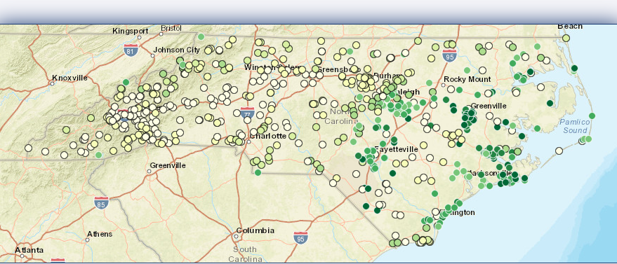
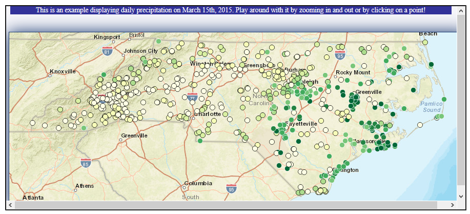
OpenLayers can display many different types of data, ranging from gridded observations like on our Integrated Water Portal to point-based values like on our Weather Map tool. Initially, I have explored how to add this point data so that it loads quickly and can be styled to look great on the map. My dynamic mapping function allows any of our developers to pass along a group of point values that are geographically-referenced in a language called GeoJSON. This language also allows theming of each point, including the color pallete, point shapes, and labels. An exciting feature in this function is that it can display data as text instead of a shape when the map is zoomed in. An example of this can be seen in the map below.
By creating these functions, any of our developers will be able to display data on a map without having to learn OpenLayers. Using the same functions for all the maps makes it much easier to fix the code if something goes wrong. Instead of having to go through several scripts, everything will be in one script so the problem only has to be fixed once. It also keeps the website looking cohesive because all the maps will be using the same color schemes and the latest version of the displaying functions.
In the future I plan on expanding the abilities of the functions so they may be used for a wider range of projects. The functions will also be used to update the current maps on our site. One in particular is the Weather Map, which is used for viewing and retrieving data across the southeast. With the new functions, the page should look a little nicer and load much faster. So continue to check in to see the progress!
- Categories:


