Summer Projects: Big Data Applications with Rainfall Estimates
This post is part of a series highlighting the summer projects from our office’s undergraduate research assistants. This post is by Geneva Ely, a recent graduate with degrees in Meteorology and Environmental Sciences.
From dialect maps to user-tailored Facebook ads, big data has been making the news rounds for the last couple years. These leaps in data crunching are due to computational storage and processing advancements. In general, it has become easier and even more convenient to store large amounts of data rather than throw it away! This summer I’ve been using big data computational techniques in order to bias correct a precipitation estimate data set called multi-sensor precipitation estimates, or MPE for short.
What is MPE?
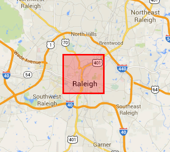
MPE uses a combination of Doppler radar and National Weather Service-maintained hourly surface rain gauges to create a fine-resolution estimate of ground-level precipitation averaged over a 25 square kilometer area. The image to the left shows roughly how large an MPE grid cell is. It is small enough to fit comfortably within the Raleigh Beltline, but not fine enough scale to estimate the exact precipitation that might have fallen in your backyard. This might seem like quite a large area to measure precipitation over, and it is! That is why I’m using more station observations to try to make this square more representative of what we measure on the ground.
At the State Climate Office, we use MPE data to monitor drought, provide construction site rainfall estimates to the Department of Transportation, and supplement our decision support tools for farmers and gardeners.
What is Bias?
Bias is simply the difference between an observed and estimated value. To use an example, the bullseye on this dart board is the correct precipitation and the darts are MPE values for precipitation. Previous research out of our office indicates that MPE lands a little higher or lower than the correct precipitation depending on certain factors like precipitation rate and type. The difference between where these MPE “darts” are landing and the true precipitation bullseye is called the bias.
Bias correction is a fancy definition for the statistically based improvement of a value. I am using several different statistical techniques to try to get MPE on target. These statistical techniques create billion-number large-data structures that require large amounts of computer memory. This is one of the main struggles that big data computational techniques has helped me resolve!
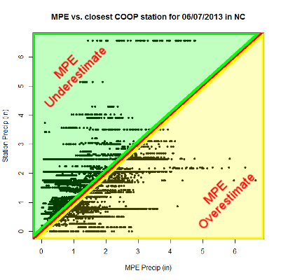
The scatterplot above depicts the MPE values on the horizontal axis and the closest observed station precipitation on the horizontal axis recorded on June 7, 2013, also know as when Tropical Storm Andrea made her way across NC. Any dots that appear near the red line are examples of where the MPE value and the closest observed station precipitation are near equal. Dots that fall in the shaded green region are where MPE is under the observed precipitation, and dots that fall within the shaded yellow region are where MPE is above observed precipitation.
One of the reasons the plotted dots in this scatterplot are not all near the red line is because of the different densities between the two precipitation data sets. I am quantifying this data density induced error by using a geographically weighted logistic regression.
How this Helps
Results of the bias correction process are still in the computational and debugging phase and will likely be evaluated in the coming weeks. If results are favorable, this could improve the usefulness of the aforementioned tools. I explained this a bit more in a previous blog post. This is just one example of several ways in which we at the SCO are implementing the big data techniques you hear about on the news at a North Carolina-centric level.
- Categories:


