New Resources Address Drought Communication Challenges
A dusty old weather pun says that drought is a very dry topic, but in practice, communicating about drought is an issue saturated with challenges, misconceptions, and opportunities.
That was the inspiration behind a NOAA-funded project that our office completed in partnership with the Carolinas Integrated Sciences and Assessments (CISA), aiming to increase the transparency and effectiveness of drought communications in North Carolina.
After two years of stakeholder engagement, resource development, and evaluation, we have wrapped up that work — titled Project Nighthawk, after the native bird species that’s both threatened by and resilient to drought — and we recently published a paper with findings from our research in the Bulletin of the American Meteorological Society.
Communication Needs
At the heart of our project was the tricky nature of drought monitoring. Unlike measuring wind speeds in a hurricane or rainfall from a thunderstorm, we can’t just put out a weather sensor and let it tell us how drought-y it is outside, nor does drought show up on a weather map like a cold front creeping in.
Our official state drought status is discussed and updated each week by the North Carolina Drought Management Advisory Council (NC DMAC), a multi-agency group that considers indicators ranging from recent precipitation to streamflows to agricultural reports to wildfire activity.
In collaboration with the US Drought Monitor, the weekly drought map shows the status using a five-point scale ranging from Abnormally Dry conditions (D0) to Exceptional Drought (D4). However, like a pie sitting on a store shelf, it’s not always clear how fresh it is, what ingredients went into it, or who across the state or country had their hands in the dough.
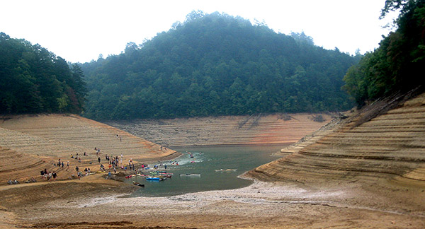
During past drought events, including the extreme and long-lived 2007-09 drought, we’ve heard frequent questions from partners, the media, and the public about when and how drought designations are determined, and who is responsible for that assessment.
In Project Nighthawk, we wanted to demystify this process and make drought information more accessible for users in North Carolina, particularly among the drought-affected agriculture, forestry, and water resources sectors.
Our engagement with these groups helped shape several new resources that can make them — and you — better informed about and, ideally, better prepared for drought events.
The Drought Status, Explained
Early in the project, a series of surveys and webinars with stakeholders helped us identify communication priorities, and chief among them was a more detailed explanation of the weekly drought maps.
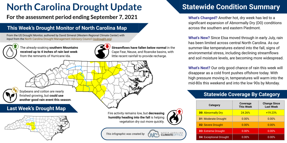
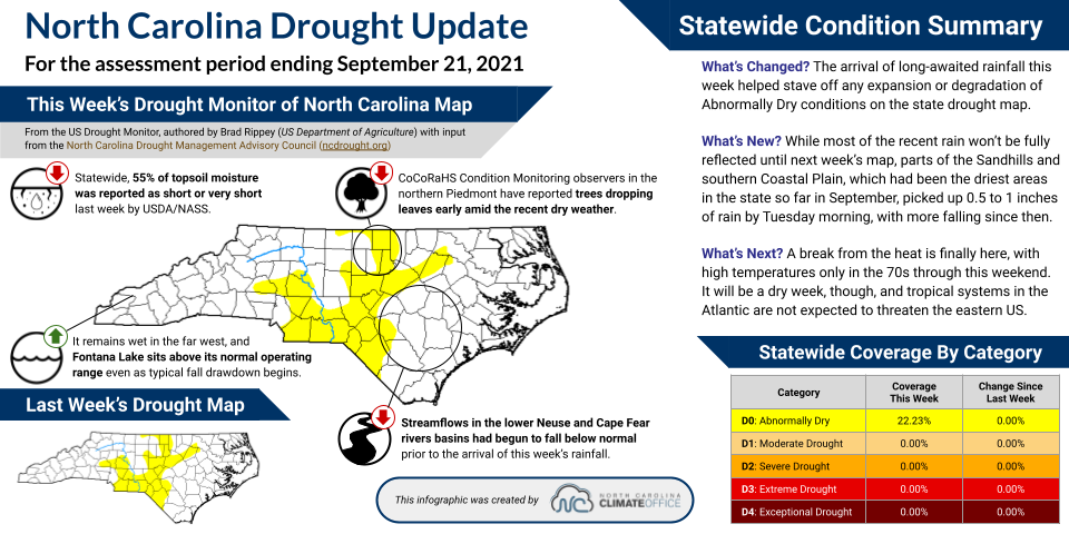
To address this, we began creating drought update infographics that include not only the drought status, but also factors that influenced it, impacts observed across the state, and climate-based perspectives of recent and upcoming conditions.
We refined these graphics using feedback from surveys, focus groups, pilot testers, and even eye tracking analysis. While the project has now ended, we’re still creating these explainer graphics, which are posted alongside the weekly drought status on the NC DMAC website, ncdrought.org. You can also join our Google Group to receive these updates via email.
Refining Weather Forecasts
Another priority for users was improved communication of forecasts over the next 1 to 4 weeks, which is when they schedule many of their weather-related decisions, from planting to prescribed burning to reservoir management.
Existing forecasts for these time periods can be tough to find and even tougher to interpret. Probabilistic guidance from the Climate Prediction Center, for instance, can offer skillful insights into our upcoming temperatures and precipitation, but can also be fraught with confusion, such as what “equal chances” of above-, below-, or near-normal conditions actually means.
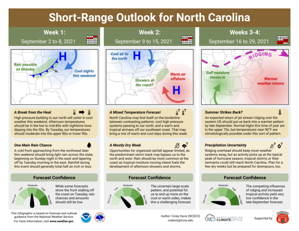
In this project, we developed new Short-Range Outlook graphics that distill National Weather Service forecasts into a more user-friendly format showing expected weekly weather patterns, impacts, and the forecast confidence.
Since Project Nighthawk ended, the North Carolina Forest Service has continued supporting these outlooks targeted for foresters, and we’re producing them at the beginning of each month. The current outlook and a recent archive are available on our fire-focused website.
Other Drought Background
While our drought updates and outlooks are updated weekly to monthly, we also produced some static resources for users who want to learn more about the nature of drought.
We developed a storymap describing the climate factors that influence drought in North Carolina and typical impacts. You can access this from our education pages, where we provide North Carolina-tailored information about our state’s climate and the weather events we experience.
On the NC DMAC website, we created a storymap explaining the weekly process used to monitor and coalesce drought indicators into a state drought status.
And as background on how historical droughts have evolved and impacted sectors across the state, we created a set of one-page factsheets about selected past events.
Communication Insights
Our takeaways from this project include more than just new resources and a better appreciation for how drought affects decision-makers. We also learned more about how to best communicate a complex topic like this one. More detailed descriptions and analysis can be found in our publication, and we’re sharing a few highlights here:
- Understand your audience. Initial surveys and webinars helped introduce us to when and how our target sectors used weather and drought information, and also how they preferred to receive this information — generally in shorter, more easily consumed formats such as infographics and factsheets, rather than longer reports and webinars. From the outset, that shaped how we tailored information for them.
- Translate technical information, but know where to stop. When summarizing complex information, an ideal balanced approach removes any jargon or potentially confusing details, but doesn’t oversimplify. For instance, we found that showing a map of streamflow gauges on our drought update infographics added confusion due to a color scale that partially overlapped with the US Drought Monitor categories, but just stating “streamflows have decreased” removed important context like geography and cause-and-effect. Instead, users preferred our descriptions like “A lack of upstream rainfall has caused streamflows in the Cape Fear River basin to drop below normal.”
- Don’t just create; evaluate! Our earliest prototypes looked quite a bit different from the final products, and for good reason: user engagement and systematic evaluation through a number of techniques helped us refine and improve these resources to make them more useful and usable. Even having a few trusted testers to provide feedback can make a big difference when targeting information for users like them.
Yes, drought may be a dry topic, but after Project Nighthawk, our cup runneth over with new ways to communicate about weather and drought in North Carolina.
- Categories: