It’s a tradition so well-established that you might not even know it happens. Every Thursday morning, the US Drought Monitor’s weekly assessment of conditions becomes the official drought status for North Carolina.
However, that’s not the case this week. The map on the front page of the NC Drought Management Advisory Council (DMAC) website, which serves as the official drought designation for North Carolina, is different than the weekly US Drought Monitor (USDM) map.
The official DMAC map for North Carolina reflects no changes from the previous week’s USDM, while the USDM’s version for this week added Extreme Drought (D3) across the southern Mountains and expanded Moderate (D1) and Severe (D2) drought conditions farther north.
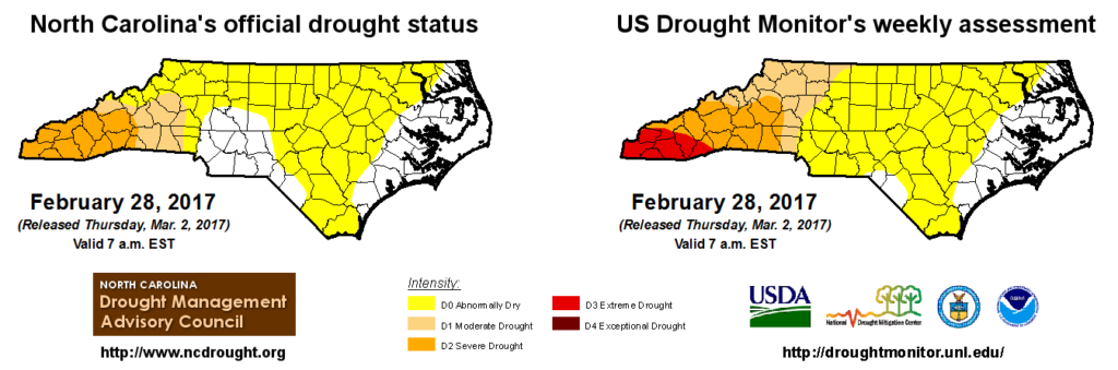
This isn’t the first time that the DMAC has adopted its own drought map, which it has the authority to do under state law. The last time was more than a decade ago, when North Carolina’s official map showed more severe conditions than the US Drought Monitor for parts of the Piedmont. In this week’s case, the situation is reversed — North Carolina’s map showing less severe drought — but it is still a rare occurrence for the state’s official drought designation to differ from the one shown on the USDM.
Before we get to the reasons behind this decision, let’s get the conspiracy theories out of the way: It’s not some attempt to discredit the US Drought Monitor or undermine its process, in which the NC DMAC has been an active participant for many years. Nor is this a case of the US Drought Monitor ignoring local input. It simply speaks to a difference of how drought is monitored and interpreted by both groups, and in this case, there is not necessarily a right or wrong answer.
The Case for Expanding Drought
The US Drought Monitor’s author, which rotates every one to two weeks, has the tough task of incorporating local data and recommendations, including those from the NC DMAC, into a seamless national map that ideally ignores state and county boundaries.
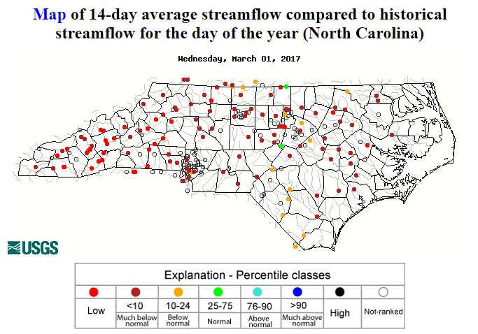
Many of the usual data-based indicators of drought, such as the Standardized Precipitation Index over the past six months, suggest that the amount of precipitation over that period is consistent with at least extreme dryness across much of the Mountains. In addition, recent streamflow levels (left) are at record lows for this time of the year in that region.
Conditions don’t look much different just across the border in northern Georgia, where Extreme Drought has been present since last June. Because of that, it was a reasonable decision for this week’s USDM author to expand those Extreme Drought conditions into our southwestern counties.
The Case for Status Quo
Drought isn’t only measured by precipitation, or the lack thereof. Impacts often define the severity of a drought, and some of the most common impacts are to agriculture and water supplies. During the winter months, plants are dormant and reservoirs don’t lose as much volume to evaporation or withdrawal. However, we would still expect to see such impacts with worsening drought.
Even after a particularly warm February, it’s tough to find much in the way of widespread impacts. Several CoCoRaHS Condition Monitoring Reports from the past month mention dry topsoils, but they also mention near-normal moisture in clay soils. The latest batch of Crop Progress Reports from the USDA suggest that pastures and wheat crops are beginning to grow, albeit slightly impeded by the dry weather. And as discussed below, water supplies are not yet a concern, even in the far western part of the state.
Thus, the DMAC’s recommendation for status quo wasn’t some attempt by North Carolina to shield itself from the reality of the drought. Keeping last week’s status balances the objective indicators the USDM was based upon with the lack of impacts that would suggest a worse drought or a change in conditions from the previous week.
What it Means
So what are the impacts of this decision?
For the southern Mountains, staying in D2 means avoiding any water restrictions that could be automatically triggered by the introduction of D3 conditions. While voluntary water conservation is never a bad idea, reservoirs across that region are at normal levels, so restrictions are currently unnecessary for water supply reasons.
For other parts of the Mountains, a designation of D1 instead of D2, or D0 instead of D1, may not have implications for water use restrictions or other decisions, but it should serve as a wake-up call. Drought conditions or something close to it are still present, as was the case much of last summer and fall.
For the rest of North Carolina, conditions look largely the same on both maps: Abnormally Dry across much of the state. Although that doesn’t mean that drought is imminent, a continued dry pattern like we’ve been in this winter would indeed lead to drought expansion and the emergence of impacts to agriculture and possibly even water supply.
Perhaps the most important message for folks in the state — not just the west where drought is currently depicted in either map — is that as we move into spring, things could change rapidly. The weather can be volatile this time of the year; temperatures may drop below freezing one day and hit 80 degrees the next. Likewise, conditions on the ground can change quickly, as can the implications of any water that does (or doesn’t) fall from the sky.
This week’s drought disparity is a reminder of something that both the US Drought Monitor author and the NC DMAC agreed about after several hours of productive discussion: Drought monitoring is difficult!