Summer Projects: Evaluating a New Drought Dataset for NC
This post is part of a series highlighting the summer projects from our office’s student research assistants. The author, Brandon Black, is a rising junior in the meteorology program at North Carolina State University.
You may have seen on the news or in our blogs recently that parts of the Carolinas have entered a severe drought. To many, drought means a drier yard and unwashed car, but it can have much greater impacts.
Monitoring drought is a constant challenge fought by specialists with accurate data and tools to determine the areas within or at risk of entering a drought. For many years, the National Centers for Environmental Information (NCEI) has provided historical drought indices averaged over climate divisions.
From 1895 to 2013, this dataset — called Drd964x — calculated the drought indices simply using the average of temperature and precipitation data from National Weather Service Cooperative Observer (COOP) stations within each climate division. However, last year, NCEI introduced a new dataset — called nClimDiv — that instead split each climate division into 5 km grids. Temperature and precipitation values were interpolated for each grid cell based on nearby station data, and the average of all the grid cells was used to calculate the drought indices. This put less weight on individual stations and provided coverage for areas with no nearby stations.
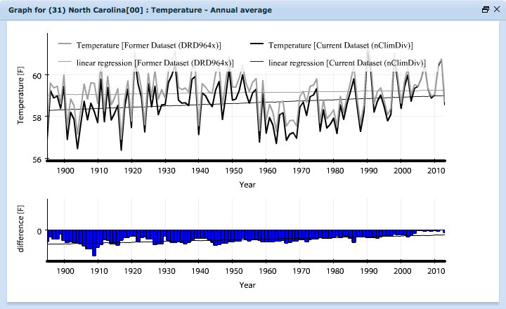
NCEI did an early comparison with temperature and precipitation and they found some differences between the two. For instance, in North Carolina, the Drd964x dataset showed no trend in temperatures from 1895-2013 while the new nClimDiv dataset has cooler temperatures pre-1940 with a dramatic warm-up following. Since NCEI did a comparison for temperature and precipitation but not drought monitoring, getting a better handle on the nuances between these two datasets is essential to understanding trends in historical drought across North Carolina.
Two drought indices were compared for this study: the Palmer Drought Severity Index (PDSI), which is based on a simple water balance model and uses temperature, precipitation and the available water content of the soil; and the Standardized Precipitation Index (SPI), which relates observed precipitation to its historical probability.
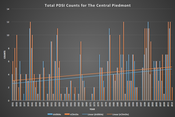
Annual frequencies were generated for each drought index, for each U.S. Drought Monitor classification.
The comparisons of the two datasets were quite interesting. I graphed the frequencies for the Central Piedmont and Northern Mountains climate divisions and found the trend line for each graph. Preliminary analysis showed that the Drd964x dataset was starting about a half to full count less than the nClimDiv. The trend line of both datasets were similar, but the nClimDiv consistently started higher as seen in the graph on the right. What this means is that the new dataset suggest it’s been drier from the year 1931 on, but that the trend in dryness is the similar to what the old Drd964x dataset indicates.
- Categories:


