How many times have you been waiting for a rain system to arrive, only to see it just miss you or dissipate before reaching your location? Or can you count the number of times you have left the store during a downpour, only to find not a single drop has fallen at your house? Don’t worry, because you’re not alone!
How do you know if this perceived weather pattern is a persistent climatological trend? Some well-known climatological rainfall patterns exist in our state. For example, Asheville often sees less rainfall than its neighbors on the windward side of the mountains due to the rain shadow effect, and coastal residents may experience more rain from thunderstorms than their inland neighbors due to the sea breeze circulation. Could a similar physical process be occurring where you live?
Recently, our office was contacted by a citizen who noticed precipitation differences in Tarboro relative to its neighboring towns. Specifically, this person observed much less rain fell in Tarboro compared to its neighbors during the warm season and used data gathered at his house and surrounding National Weather Service (NWS) storm reports to support this.
Additionally, the caller cited many instances where a rain system dissipated before reaching Tarboro only to form again downwind. Our office was intrigued by the observation and decided to launch an investigation to get to the bottom of this mystery!
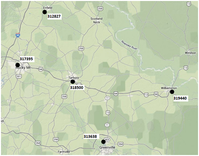
In our investigation we used two Cooperative Observer Program (COOP) stations, Rocky Mount [317395] and Enfield [312827], to the west and two stations, Williamston [319440] and Greenville [313638], to the east of Tarboro and its observing station [318500]. We gathered rainfall totals for the warm season, defined as May through September, starting in 2000 and going until 2012. The bar chart below shows how Tarboro compared to its surrounding stations for the period in question (note that the Enfield COOP station is missing 2012 data).
What does this bar chart tell us exactly? In 2004, 2008, 2009, and 2010 Tarboro did indeed have less rainfall than surrounding areas. However, in 2006 we see Tarboro actually had the most precipitation of all five stations. At the right end of the bar chart you can see the averages for the entire period of analysis. Tarboro falls right in the middle with stations to the west averaging less and stations to the east averaging more precipitation. Does this mean there is a “dry bubble” over Tarboro?
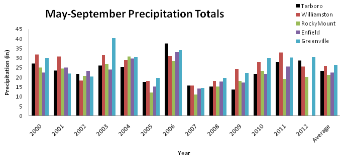
The answer here is not a simple as you might think. We did a statistical analysis (Wilcoxon Signed-Rank Test for the curious) of each location compared to Tarboro and we found that any differences we did find are not statistically significant. This means that while we did observe differences in precipitation over all these stations, we cannot say with any statistical confidence that these differences are not due to random chance.
From the graph, we can see that stations to the east of Tarboro are reporting more precipitation. Could this be due to storms reforming to the east of Tarboro like our caller claimed? Maybe, or maybe not. It could also be due to tropical systems, the occasional sea breeze front, or, as the statistical test implies, random luck. As you can see from our analysis, precipitation can be quite variable over just a small swath of North Carolina.
Next time you notice your neighbors getting rain while you stay dry, make a note of it. If you see a trend, contact your friendly neighborhood climatologist here at the State Climate Office. We are always happy to get to the bottom of a well-reasoned mystery!