Upgrades to Wind Rose Tool
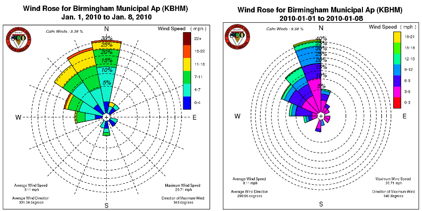
A wind rose is a graphical tool used to show wind speed and wind direction for a particular location over a specified period of time. The wind rose is divided into a number of spokes which represent the frequency of winds blowing from a particular direction. For example, the longest spoke on the wind rose represents the greatest frequency of winds blowing from that particular direction over the specified time frame.
We are excited to announce that an updated version of our wind rose tool is available! This web product now has new search capabilities that make it a more powerful climatological resource, along with a new look that we hope will make it easier to visually process.
New Search Functionality
We have added the ability to plot a wind rose for a specific range of calendar days. This could be a specific day, week, month, season or any other period the user selects over a range of years. This new functionality allows the wind rose to be used to study wind patterns during specific times of the year, and also analyze changes in wind patterns at a station.
For an example of how this new functionality could be used, image that you are interested in knowing if the winds near your location came from the north more frequently during winters in your childhood than they do now. With this new feature, it’s easy to look at just the winter season for a range of years (for instance, December 1st to March 1st for the years of 1970 to 1980). You can then right-click on the wind rose image, save it, and then repeat the process for another period for comparison (for instance, December 1st to March 1st for the years of 2002 to 2012). We’ve been excited to perform some wind climatology analyses ourselves, and we hope our users will find this new feature useful as well.
Cosmetic Improvements
As shown in the comparison figure above, the previous version of the wind rose was not able to plot on the axis of the four cardinal directions (north, east, south and west). By correcting this, it makes the wind rose easier to interpret and more accurate! The coloring of the wind rose petals was also adjusted to make the ranges easier to see. In addition, the color intervals were staggered in larger increments to better highlight the wind speed ranges. There were a number of other minor adjustments made to the look and wording found in the tool, but we’ll let you discover those on your own!
- Categories: