Welcome to Our New Website!
Your eyes aren’t deceiving you. Today, we re-launched our website with a new look and a slightly different layout. But fear not: the same weather and climate information you’re accustomed to finding from us is still here!
To help acclimate you to our new NC Climate Office website, here’s an overview of the changes and how to find what you’re looking for within our updated interface.
Note: This blog post refers to a previous version of our website. Links to specific tools have been updated to their current versions, wherever applicable.
A Fresh Coat of Paint
We’ve heard it’s bad form to wear white after Labor Day, but we can’t help it! Perhaps the most noticeable change is the new white and blue color scheme, giving our website a modern and consistent look across all pages.
While updating our site to use these colors, we also renovated our Interactive Maps and Weather Event tools to use the latest open-source web mapping environment. Along with getting a facelift, our SPC Storm Reports Map was renamed to the Severe Storm Reports Tool, and our Fire Weather Intelligence Portal was expanded to include data for 13 southeastern states.
No-Fuss Navigation
Gone are the days of searching through three layers of nested menus to find what you’re looking for. Instead, we’ve simplified our top menus to better feature our most-viewed content, such as our climate education material, ways to view and request our data, and web services including maps and tools.
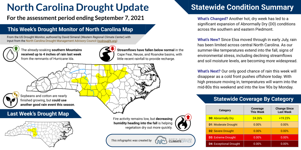
In some cases, these menus will direct you to landing pages with relevant content, such as our information about hurricanes. We’re also working on putting our content into story maps; you can see an example on our page about drought in North Carolina.
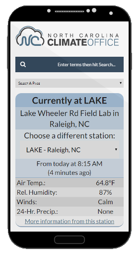
In addition, we have de-cluttered our homepage, highlighting current conditions from our ECONet and featuring prominent links to commonly used pages, including the Climate Blog.
A Design for All Devices
You’ve got them in your pocket, in your purse, or even in your hand. Smartphones and tablets have become increasingly popular for web browsing, so it’s no surprise that over the past five years, the amount of traffic visiting our site from mobile devices has more than quadrupled!
To better meet this increasing amount of mobile users, our new website has a responsive design that should work with almost any screen size. While some of our map products are still best viewed on a larger screen, our tools are available to be viewed on any device.
In addition to these changes, we’ll be making other updates in the coming months. Expect to see more story maps added, other tools renovated and migrated to the new site, and eventually, a new interface developed for requesting and retrieving data.
While we’re working on these features, you may notice some broken links or wonder where to find a particular bit of content. Feel free to contact us with any questions or comments to help you — and us — better sort things out.
With that introduction out of the way, feel free to adjust your eyes, browse with briskness, pull out all of your devices, and explore our new website!
- Categories: