Are Those Values Real?!
Sometimes, looking at climate data on a daily basis always brings new and unexpected results. One such result occurred earlier in November when relative humidity (RH) values at five of our western NC ECONet stations were below 10%.
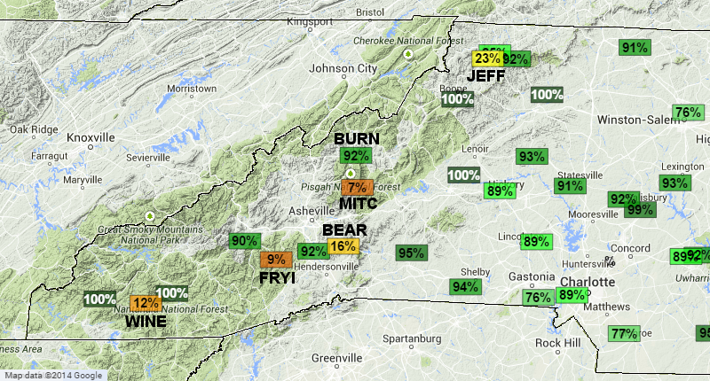
To put this in perspective, on the driest days in North Carolina, RH values will rarely dip below 20%. The map below shows RH values from all the nearby stations during one November morning — you’ll notice that the low RH stations stick out like a sore thumb. The one station (BURN) highlighted on the map is at 2700 ft. above sea level and had a RH of 92%. The five low RH stations (Bearwallow Mountain, Frying Pan Mountain, Mt. Jefferson, Wayah Bald Mountain, and Mt. Mitchell) are between 4608 ft. and 6200 ft. above sea level.
These values were instantly flagged as suspect by our automated quality control routines. Even our scientists initially thought these were invalid values. Usually, if one station shows these type of anomalies, we assume it is bad and move on. However, when multiple stations start showing similar tendencies, our curiosity leads us to find a possible explanation for what is happening.
One idea was to look at data from weather balloons launched around the same time period. This data is then put onto a graph called a Skew-T Log-P diagram (shown below). It’s called a skew-T because the temperature lines skew to the right as you go up the page. We’ve highlighted the 0 degrees Celsius and 10 degrees Celsius isotherms (lines of constant temperature) for reference.
You read this graph by starting at the bottom and reading up. The dark black lines on the graph show temperature (the right line) and dew point (the left line) of the weather balloon as you go up in the atmosphere. The ratio between dew point and temperature can give you a rough indication of relative humidity. The closer the two lines are, the higher the RH, and vice versa.
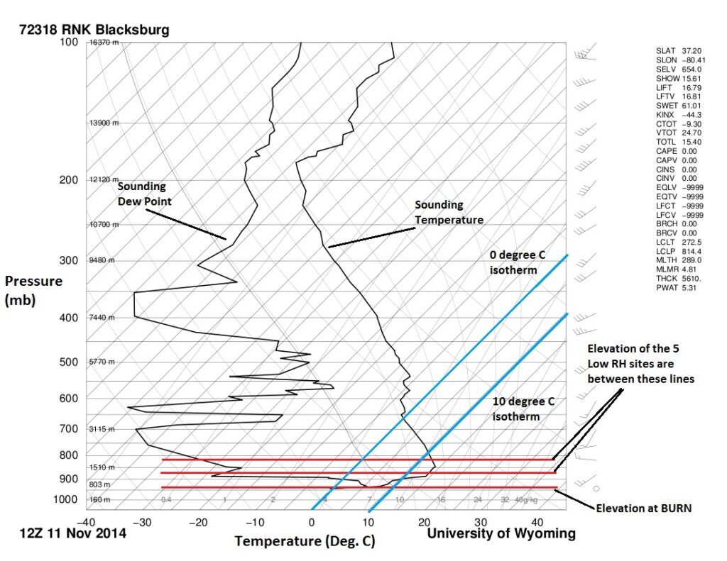
The skew-T image shown is from Roanoke, VA, taken at the same time as the readings on the map. The elevations of the BURN station and the five high-elevation stations are denoted by the red lines on the skew-T diagram.
The one major thing to notice on the skew-T graph is how the sounding temperature line moves to the right as you go up in elevation near the surface. This indicates temperatures warming with height, or an inversion layer.
Not only do the temperatures warm up, but the dew points drastically decrease (the line on the left moving further to the left). In fact, the sounding temperature at Mt. Mitchell’s elevation was 12.4°C (54.3°F) with a dew point of -28.2°C (-18.8°F)! This equates to roughly 7% RH, which is what the map shows.
This verification led our scientists to override the automated quality control and give these a passing score. It also shows that sometimes, those strange values may actually be right!
- Categories:


