Meteograms
Viewing a map of conditions across a region can be a useful way to spot variations and extremes of a given parameter, but what if you want to focus on a single station and view many of its recent observations? This is where meteograms, another powerful Portal feature associated with point observations, can help.
A meteogram is simply a graph of the weather history of a parameter. Meteorologists often use them to spot trends in weather observations, such as changes in temperatures or humidity levels over a day or week. Many foresters will be familiar with a similar concept for viewing fire danger information on PocketCards, and the meteograms in the Portal replicate much of the same functionality.
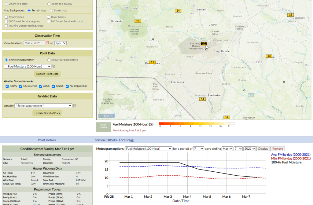
Viewing a meteogram is easy. Once you have plotted a point dataset on the map, just click on any station and a panel of station details, including a meteogram, will load below the map.
Let’s take a closer look at these meteograms and their features.
Basic Meteograms
For most weather variables, the meteogram will simply show a line on the graph connecting observations from your selected station. By default, the meteogram will show the 30 days of observations ending on your selected date (or today’s date, if you’re on the Current Conditions tab).
You can change the parameter being plotted, the number of days being shown, and the end date using the dropdown menus above the meteogram. To zoom in on a specific part of the meteogram, click and drag your mouse to highlight a section of days, then release your left mouse button to zoom to that period.
As you hover your cursor over the meteogram, it will show each observation, including the date/time and the exact value, on the right side.
Example:
After a recent cold frontal passage, you’ve noticed the air has gotten drier, but you’re curious about when and how it happened. After loading current Relative Humidity observations on the Portal map, you click on a weather station near you in the Virginia mountains.
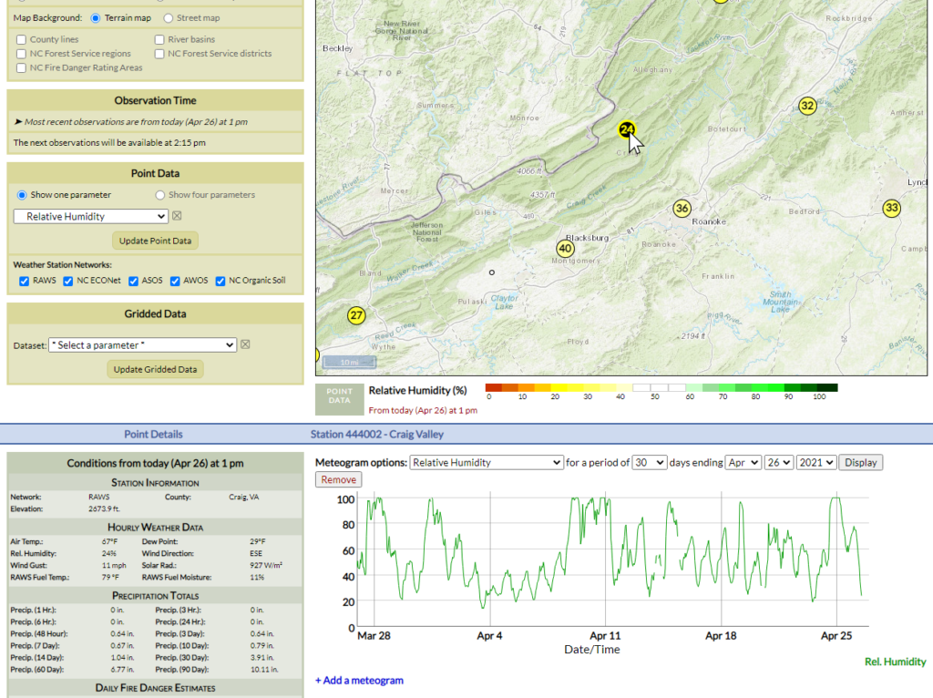
On the default meteogram view showing the past 30 days, you also see part of early April in which humidity levels were low for several days. They have generally been higher since then, but dropped rapidly over the past few days. To see this period in more detail, you click and drag your mouse over it to highlight it.
Mousing over the zoomed-in meteogram, you notice that relative humidity levels have fallen from 100% yesterday at 4 am to 24% today at noon.
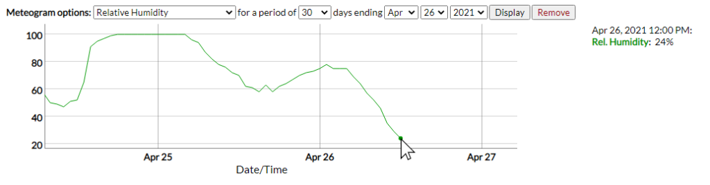
That’s a big decline in just 32 hours, which tells you to be aware in case fuels rapidly dry out and fire danger increases.
Fire Danger Meteograms
For most weather variables, their meaning is fairly intuitive: 24% relative humidity is dry, 100°F is hot, and two inches of rain in an hour is a lot. For fire danger data, though, you may not always have these mental benchmarks, and for some parameters, the meaning of a high KBDI or Burning Index can vary by station or by season.
To help put this fire danger data into context, many of these parameters will show additional reference lines on the meteogram. These can include the historical average, maximum, or minimum values for that day of the year based on your selected station’s past observations, similar to what you might see on PocketCards.
Many stations in the Portal have at least five years of data, but note that these historical average, maximum, and minimum values might not include some events in the more distant past, during which a given station may not have been operational. In other words, if the ERC is approaching the historical daily maximum value, just remember that statistic only includes the years in which that station has been reporting.
Example:
It’s the end of the spring in central Florida, and you’re checking one of your local RAWS stations to see how its fire danger has changed lately, and how relatively high or low values have been compared to the recent past. In the Portal, you first display Keetch-Byram Drought Index on the map and click on a nearby station.
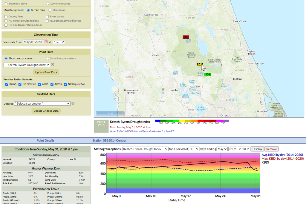
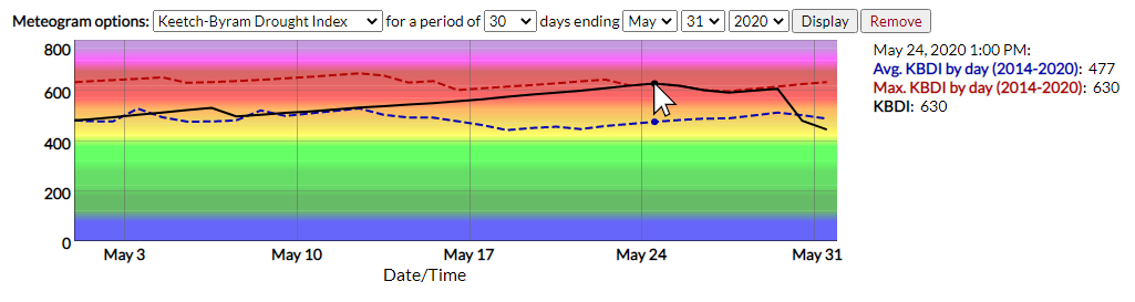
The meteogram of KBDI over the past 30 days shows that they started the month near the historical average (shown in the dashed blue line), calculated from 2014 through 2020, then steadily increased until they set new daily maximum values late in the month. Hovering over those values, you find when they reached their peak on May 24.
Next, you load the 100-hour fuel moisture content using the Meteogram options dropdown menu. They also started the month near the historical average, then declined to set new daily minimum values for this station’s seven-year period of record. In the final week of the month, fuel moisture values rose back above the historical average.
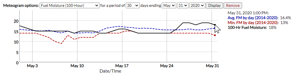
Based on this assessment, you share with foresters in your area that fire danger is generally at or slightly below typical levels for this time of year entering the summer, but caution them that a string of dry days like you had in mid-May could cause fire risk to increase quickly.
Multiple Meteograms
If you want to compare several parameters side-by-side, the Portal allows for plotting up to three meteograms at the same time. After selecting a station, click the Add a meteogram link to show display options for an additional meteogram. Select your parameter of interest and click the Display button to load that data. You can also click on the Remove button to turn off meteograms.
Note that as you change the date range or zoom in on one meteogram, all others will adjust their zoom extent as well to ensure you’re always comparing across the same time period.
Example:
It’s a fire danger mystery. Despite a stretch of cool, cloudy days recently, fuel moisture values have been steadily decreasing, and you’re in search of the cause. Loading multiple meteograms in the Portal can help you check conditions across several parameters.
To begin, you load 100-hour fuel moisture content on the map and click a nearby weather station to view its meteogram. Adjusting the time period to view only the last 7 days, the recent decline in fuel moisture, from above-average to near daily minimums, is easy to see.
Using the multiple meteogram functionality, you add additional graphs showing air temperatures and hourly precipitation over this same 7-day period. The temperature plot confirms what you’ve noticed — that recent temperatures have generally been in the 50s, with only a few days in the 60s or warmer.
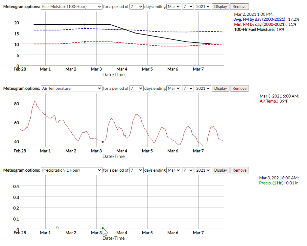
However, the precipitation plot reveals the culprit behind those declining fuel moisture values. In the past week, rainfall has been extremely limited, and the last measurable precipitation was just 0.01 inches four days ago. Despite the unseasonably cool weather, a lack of rain has nevertheless helped fuels dry out.
In the next section, we’ll move on from these station-based datasets and look at the extent of Gridded Data available in the Portal.