Gridded Datasets
While point datasets offer a critical ground truth for local conditions, the limited density of our weather station networks means there won’t always be a representative station near you. In those cases, gridded datasets can help fill in data gaps between stations and provide local guidance even when no stations are nearby.
True to its name, the term “gridded data” usually refers to data presented on a uniform grid. Each grid cell might cover an area of a few square miles, and the value of each cell would be representative of that area, whether it’s on the top of a mountain, the mouth of a river, or the middle of a forest. With hundreds or thousands of grid cells covering an individual state, they collectively paint a detailed picture about conditions across that region.
The list of gridded datasets in the Fire Weather Intelligence Portal also includes resources that aren’t truly gridded in nature, but that are spatially continuous — that is, they span across an entire region, broken down not by grid cells but by counties, polygon areas, or other discrete zones. These can also help show conditions applicable to your location, including a number of forecast products, which are covered in the next section of this user guide.
For now, let’s go over some of the gridded datasets available on the Past and Current Conditions tabs.
Weather and Fire Hazards
A key aspect of situational awareness is knowing what the weather is doing all around you. This first set of gridded datasets can help with exactly that need:
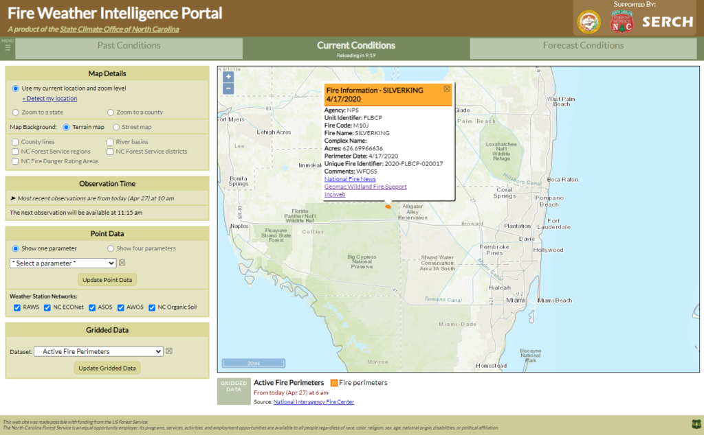
- On the Current Conditions tab, you can view Current Wildland Fire Perimeters provided by the National Interagency Fire Center. This layer displays recently updated fire events reported through the IRWIN (Integrated Reporting of Wildland Fire Information) service. Fire perimeters show up on the map as orange polygons. Click on any of them to view more details, including the current acreage of each incident.
- Also on the Current Conditions tab, Watches and Warnings issued by the National Weather Service are available. This layer displays color-coded polygons corresponding to active watches, warnings, and advisories. Some of these may be more weather-related, such as flood warnings or frost advisories, while others may be directly fire-relevant, such as fire weather watches, red flag warnings, and wind advisories. Click on any of the polygons to view more details, including the date and time when it expires.
- For both Past and Current Conditions, Lightning Strike Density data is available. This product aggregates lightning strike detections into a high-resolution grid showing the number of lightning strikes across a given area over a period ranging from 3 hours up to 72 hours in length. It is designed to show whether any lightning was occurring over a given area, but not exactly where specific strikes occurred. Click on a grid cell to view the number of detected strikes over the time period you’ve selected.
Example:
A wildfire has been burning for more than a week in south Florida, and springtime storms have started popping up recently, increasing your concern that an errant lightning strike could cause further ignition. You turn to the Portal for more about this burn and recent lightning occurrence.
From the Gridded Data menu, you first select Active Fire Perimeters and zoom in on the fire location. This shows you the extent of the fire, and clicking on this feature tells you that it’s currently confined to about 626 acres in the northeast corner of the Big Cypress National Preserve.
You then change the selected gridded dataset to Lightning Strike Density over the past 48 hours, covering the period in which you’ve noticed storms across the state.
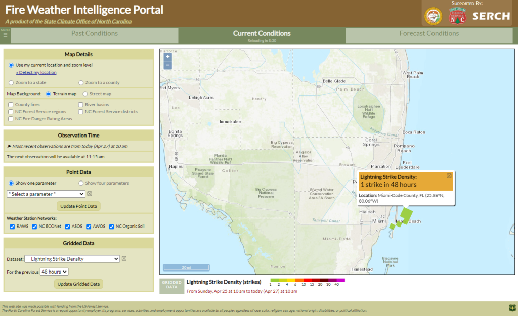
In this case, you’re relieved to see no recent strikes over the Preserve, with the closest strikes occurring over Miami Beach. As you head further into the spring, you make a mental note to recheck these layers regularly to track fire locations and lightning occurrence across your region.
Radar and Satellite
Watching the weather evolve over the course of a day can help you better anticipate conditions that may affect your area, whether that’s a rain shower that may douse your prescribed burn site or a thunderstorm that could produce lightning over a fire-prone forest. Radar and satellite imagery in the Portal can help you identify and follow these features as they develop.
National Radar imagery shows the radar from the date and time you have selected. It uses the standard color scale from the National Weather Service based on the reflectivity of features in the air above each grid cell, whether it’s tiny raindrops, large hail, or even birds flying away!
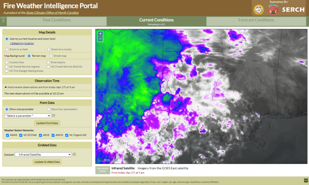
For Current Conditions, the Infrared Satellite imagery can also help identify features, including low clouds (shaded in white) that may indicate dense fog or otherwise a region with reduced mixing heights, high clouds (shaded in green or yellow) that indicate the tops of thunderstorm-producing anvil clouds, or even smoke plumes produced by large wildfires.
Note that if active and impactful weather is affecting your area, you should consult your local National Weather Service office for the most up-to-date radar, expected hazards, and any active warnings.
Example:
On the morning of a planned prescribed burn near Baton Rouge, LA, you notice some clouds off to the west. Are those just fair weather cumulus clouds that won’t cause a problem, or a sign of incoming rain that would put a damper on your burn? You check the Portal for the latest conditions.
The Infrared Satellite imagery shows a mix of low to medium cloud tops (white and purple colors) across southern Louisiana, with some higher or thicker clouds over east Texas.
The National Radar confirms your fears: some of those clouds are producing rain showers less than 100 miles away from your burn site.
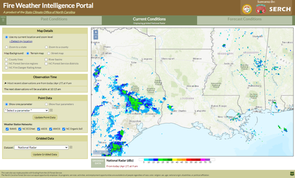
With the potential for low clouds and rain across your area today, you decide to postpone your burn and wait for a day with better weather.
Precipitation and Drought Data
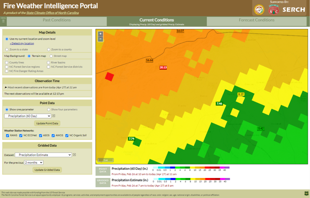
As a supplement to the precipitation estimates you may view from weather stations, gridded precipitation datasets are also available in the Portal that show estimated precipitation totals, along with how they compare to normal amounts.
These datasets are provided by the National Weather Service’s Advanced Hydrologic Prediction Service. They use radar-based precipitation estimates calibrated with surface rain gauges to create a national grid of accurate precipitation data at a fairly high resolution; each grid cell is about 4 km by 4 km, or 2.5 miles in length and width. That is generally sufficient to capture the localized rainfall you might see with springtime and summertime showers and thunderstorms.
Several different datasets are available from this product line:
- The Precipitation Estimate dataset shows accumulations, in inches, over your specified time period, ranging from 3 days up to 12 months. Clicking on a point will show the value for that grid cell.
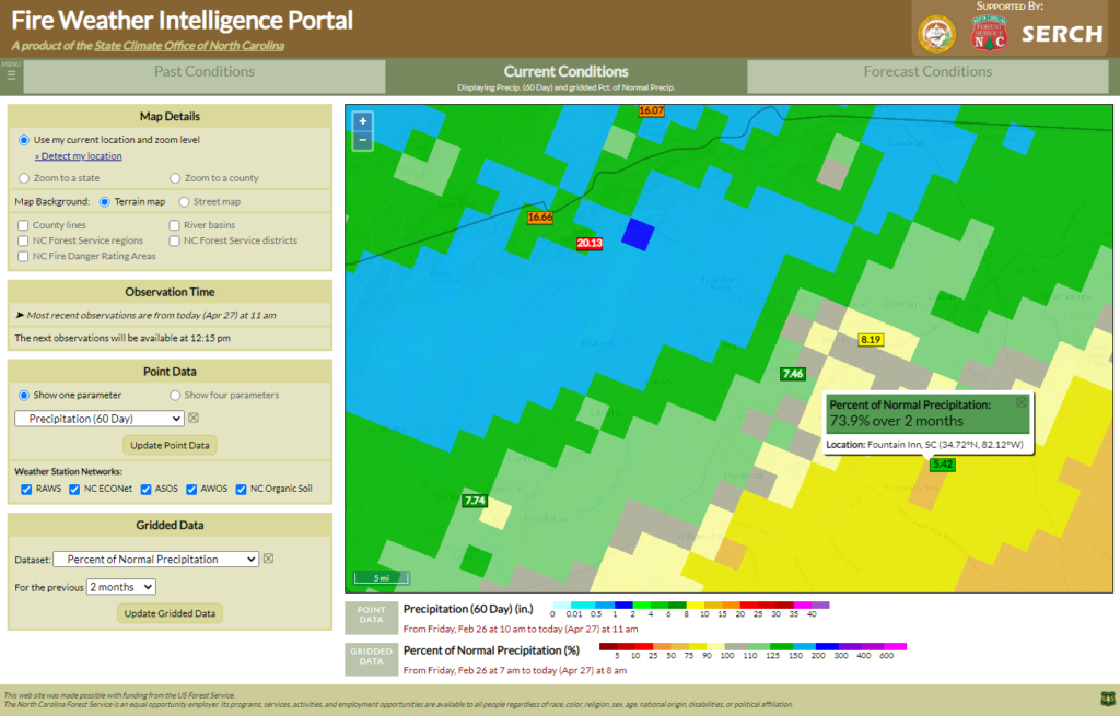
- The Percent of Normal Precipitation dataset can be one of the most useful for viewing recent precipitation in a climatological context. For instance, is two inches of rain in the past 30 days approximately normal? Or half of the normal amount? Or even less than that? You can view the same time periods, ranging from the past 3 days to the past 12 months.
- The Departure from Normal Precipitation dataset also puts recent precipitation in perspective, although in this case, it shows the actual amount it is above or below normal instead of calculating it as a percentage. Be aware that it can be misleading to compare departures from normal across regions with different climates. For instance, a one-month departure of 1 inch in a coastal, tropical region would have very different impacts than in an arid desert region, where it would represent a much greater fraction of the expected precipitation during that time of year.
Note that these precipitation products update once per day, and the latest versions generally become available at noon Eastern time.
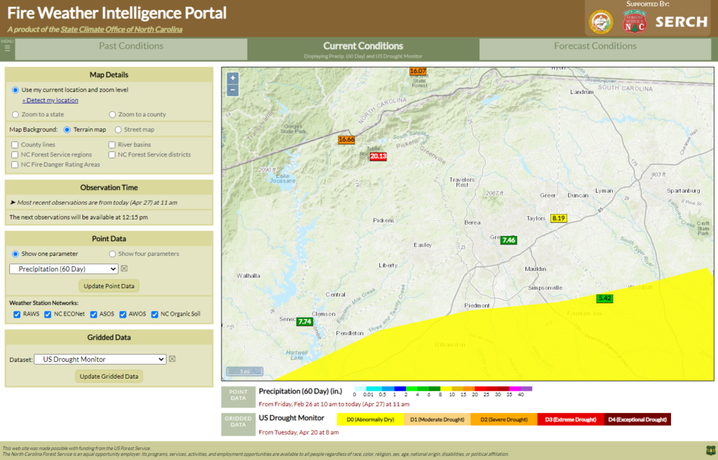
Also under this Precipitation and Drought Data menu heading, you can view the US Drought Monitor boundaries for the most recent completed week relative to your selected date/time. This is a national product, based on a combination of objective precipitation and drought indices, and informed by local and state-level input about drought impacts to sectors including agriculture, forestry, and water resources. The US Drought Monitor is updated every Thursday morning based on data ending on Tuesday, which gives time for authors and local drought advisory groups to collaborate and update the weekly drought map.
Example:
The spring so far across upstate South Carolina has seen a drastic falloff in precipitation amounts over a short distance. The point-based 60-day accumulations show amounts as high as 20.13 inches and as low as 5.42 inches. This makes you wonder: How widespread are the highest amounts? How much of this region is above normal? And what is the current drought status?
First, you plot the Precipitation Estimate over the past 2 months, alongside the point-based totals. Comparing with the legend, you note that regions in gold, orange, and red have received more than 10 inches of rain.
Next, you display the Percent of Normal Precipitation over this same time period. Sites with 7.5 to 8.5 inches observed are near normal, while the station with only 5.42 inches is around 74% of normal, as clicking on the closest grid cell reveals.
Finally, the latest US Drought Monitor shows that driest site is just inside the Abnormally Dry region, shown in yellow. While this is not technically a drought designation, it tells you that the recent dry weather has begun to make an impact, potentially even on forestry and fire conditions.
CPC Weekly Climate Division Data
Additional drought indices are available from the NWS Climate Prediction Center. This dataset is updated once per week, on Monday evenings reflecting conditions as of the previous Saturday, and is aggregated by climate divisions, or collections of counties with similar geography and climate. Two key drought indicators from this dataset are featured in the Portal:
- The Palmer Drought Severity Index has historically been trusted as a measure drought conditions over longer time periods of roughly 9 to 12 months. It uses a basic water balance equation to account for moisture gains due to precipitation and losses due to evaporation (based on temperatures). Negative PDSI values indicate dry conditions while positive values indicate wet conditions.
- By contrast, the Palmer Z-Index is a measure of short-term dryness only over the past month. Negative Z-Index values represent dry conditions while positive values represent wet conditions at a monthly timescale.
Example:
To investigate how moisture conditions across your state are evolving between the long-term and the short-term, you view the Palmer indices from the CPC weekly climate division dataset.
The Palmer Drought Severity Index across Arkansas shows drier long-term conditions in the central and north-central parts of the state.
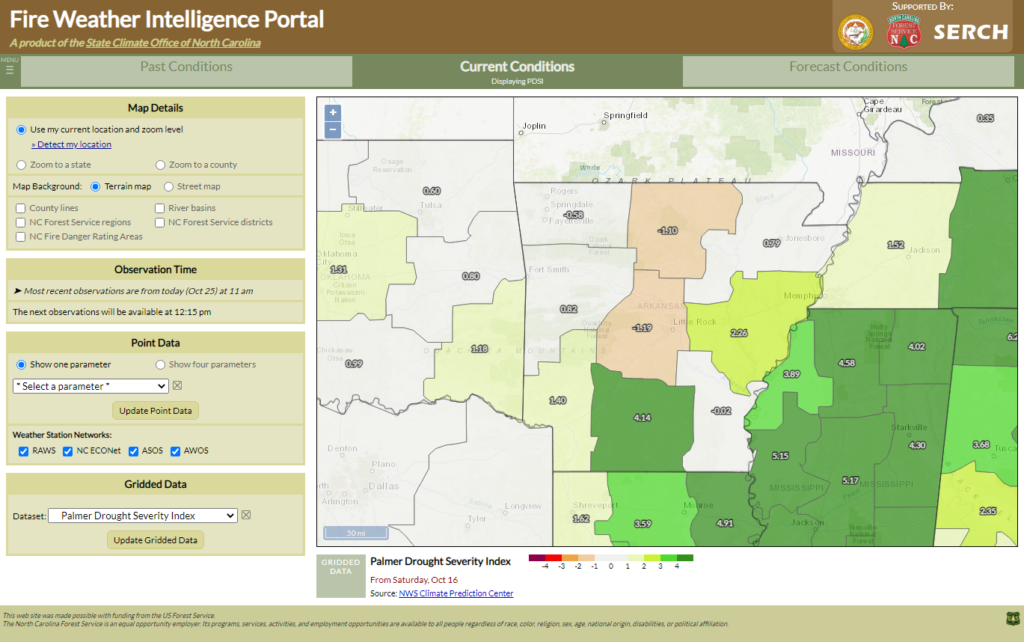
However, in the short-term, the Palmer Z-Index shows these regions are near-normal.
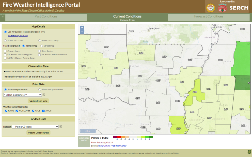
While you can’t rule out ongoing impacts of the longer-term dry conditions, which could include more flammable surface-based fuels, the recent moisture recovery helps reassure you that the fall fire season may not be as severe as you once feared.
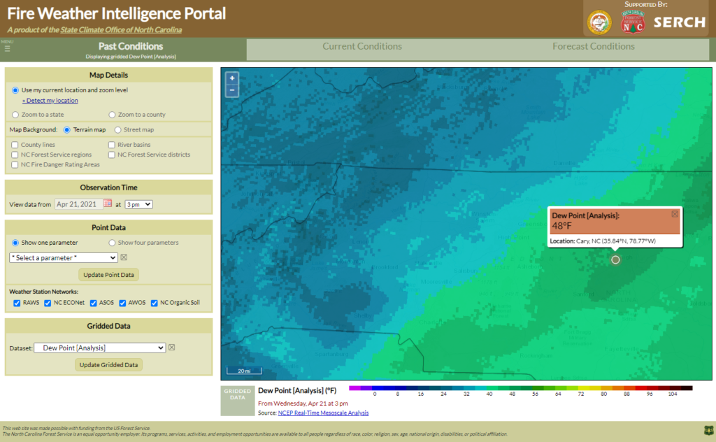
High-Resolution Weather Analysis
The National Weather Service also creates a product called the Real-Time Mesoscale Analysis, which is a very high-resolution (2.5 km, or 1.6 mile, grid cell size) gridded overview of various weather parameters at a given time. The RTMA is created using up-to-date surface weather observations and satellite imagery, which are then interpolated across a grid, accounting for features such as terrain.
RTMA data is used by National Weather Service forecasters as a starting point for developing local forecasts. Several of its fields are made available in the Portal as well to assist with situational awareness and condition monitoring in areas without many nearby weather stations.
On the Past and Current Conditions tabs, you can access analyses of Air Temperature, Dew Point, and Wind Speed, with an archive dating back to May 2013. Click on any grid cell to view the exact value at that location.
Example:
Ahead of an afternoon cold frontal passage, you’re expecting conditions to become dry and gusty in a hurry. Using the High-Resolution Weather Analysis datasets in the Portal, you get a closer look at exactly where the driest air and high winds and located.
First, you load the latest Dew Point analysis. Clicking on your location near Raleigh, you see an ambient dew point of 48°F. However, dew point values in the western part of the state are in the mid-20s.
Looking next at the Wind Speed analysis, you see a pocket of higher winds near Greensboro, including sustained winds of nearly 25 mph.
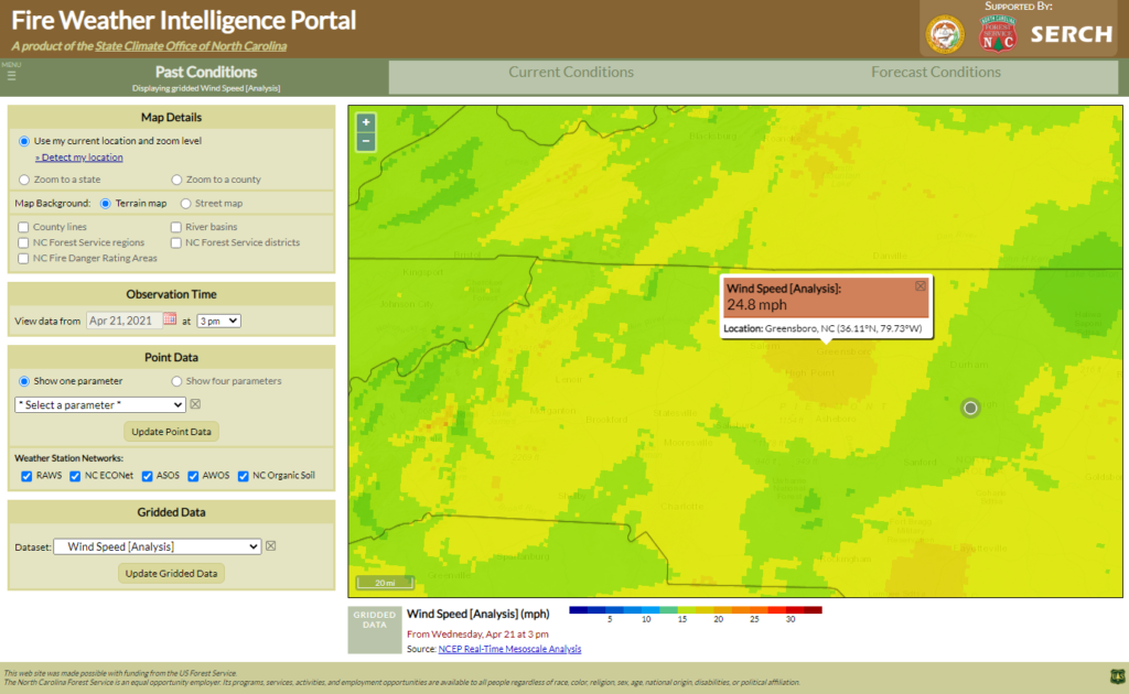
That alerts you that any ongoing fires — even small debris burns — could quickly spread out of control with strong winds and dry air moving in.
That’s not all when it comes to gridded data! Additional products including computer model guidance for key fire and smoke variables are available as well. These are described in the Forecast Products section of the user guide.